It was therefore of interest to me to determine how close the synthetic ultramarine lay to the natural form. After all, the historical pigment has been described by such seminal figures as Cennino, possibly the first true colour man, as "... a colour illustrious, beautiful and most perfect, beyond all other colours; one could not say anything about it, or do anything with it, that its quality would not still surpass." Could the form that we produce today in such quantity to sell all around the globe retain such a chromatic brilliance?
If we looked at most literature sources, then we would say not. Typically, the synthetic form is described, in this case by the most famous of colour men, George Field, as "darker and less azure." In other words, not as blue and therefore not as faultless as the natural form, which after all, because of its price, was usually reserved for the painting of the robes of Mary and the Christ child. There were also problems with the synthetic form's inherent shape: the modern production methods apparently left the primary pigment particles "smaller and more rounded," which "cause a duller colour" than the natural particles, which were "flattish and of irregular size and angular shape."
The synthetic form is even said to be "less permanent," and the loss of colour of ultramarine due to acid attack is claimed to be "almost exclusive to oil and synthetic ultramarine paints." However, it is often correctly pointed out that when both forms are tested by analytical techniques such as X-ray diffraction, they are indistinguishable from each other, indicating identical crystal lattice structures. Figure 1 illustrates the Ultramarine Blue pigment structure.
So it seems that despite the chemist's best efforts, the pigment synthesized industrially could never approach that which is created over millions of years, and almost impossible to obtain in quantities larger than a few grams, despite being identical in form. This was discussed by D.V. Thompson in "Materials of Medieval Painting," where he does correctly attribute the synthetic form with the same characteristics as the natural. He says, "But perfection, rarity, intrinsic superiority, give the flawless, genuine stone a value based on a human quality which has survived all logical arguments against it. We rationalize; we persuade ourselves, if we think of using genuine ultramarine, that it is subtly more beautiful than other blues."

What is Ultramarine Blue?
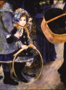
So what is this pigment of unique colour, most brilliant of all the blues, the source of Titian's vaulted heavens or Renoir's Les Parapluies, without which both Impressionist and Renaissance masterpieces would have been very different? Whether natural or synthetic, the pigment consists of an aluminosilicate lattice, with the sulphur radical anions S3- trapped within the cage-like structure. It is unique among readily available pigments, as it is the only example of an anion-anion charge transfer reaction. In other words, the colour is provided by the movement of electrons within the various energy levels that the sulphur radicals possess. Therefore, the sulphur chromophores in ultramarine behave in a completely different way to any of the other sulphur-containing pigments.
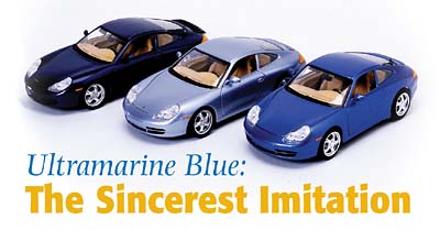
Today, the ultramarine produced by Holliday Pigments (formerly Reckitts), formed in 1884, is carefully controlled to give the strongest and reddest hue of any other ultramarine produced artificially. Surely then, after 120 years of refinement, the synthetic form must begin to approach the natural.

Comparing Natural to Synthetic
With the instrumentation of a fully modern colour lab available to me, the obvious decision was to compare the pigments like for like, gathering full colour data by means of a spectrophotometric analysis. The first question was what media should we use to compare? It is well known that ultramarine's colour is most brilliant in aqueous solutions, with a distinct darkening taking place when dispersed into oil media. Of course, this is a consequence of the similarity of refractive indices between the oil and pigment, also causing it to be highly transparent. The standard industrial Quality Control test for tinting strength is performed in linseed oil with a high percentage of titanium dioxide to give a 5:1 reduced shade that is known to be reproducible and easily understandable in terms of changes in strength or hue. However, this pale shade isn't something that most artists would associate with the glorious masstone of ultramarine blue. Therefore, I decided to work with an aqueous system that could provide the brightest results as well as naturally providing some degree of opacity to ensure the most accurate reading from the spectrophotometer.Once the method was formulated, the next step was to pick the pigments I would use as a comparison. Kremer Pigments of Germany supplies a modern recreation of classic pigments, manufactured using the traditional processes. It therefore seemed sensible to compare not just the natural vs. synthetic ultramarine, but also other pigments that lie within the blue part of the spectrum. The data produced would provide enough information to allow the creation of a colour wheel describing the position of the pigments based on their relative hue and chromaticity. Such colour wheels have been in existence for hundreds of years, with pigments suggested for the "ideal" primary and secondary colours. However, none incorporate both the modern and ancient pigments, giving a representation of what might have been lost or gained during the many years' progression in colour technology.
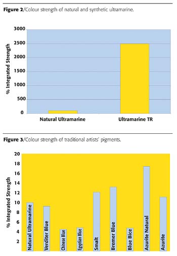
Pigments under investigation are listed in Table 1. These pigments were ground into a synthetic aqueous resin (Synthomer Emultex VV579) at equal loadings (12.5% pigment) using a centrifugal mixer in conjunction with glass grinding media. The resulting dispersion was drawn down onto uncoated card using a No.6 Kbar. The resulting drawdowns were measured using a Gretag Macbeth spectrophotometer and the results plotted against the Lapis Lazuli standard. Due to the varying colour strengths of the pigments the colour results calculated using the CieLab equation have been computationally adjusted for strength to give relative da and db values.
In the comparison of blue pigments, we can use the colour equation CieLab where: L represents Luminosity, from 0 (black) to 100 (white). A change in ‘a' represents a move from green (negative) to red (positive), and change in ‘b' represents a move from blue (negative) to yellow (positive).
Results
What can we conclusively say about these results? Certainly that the natural ultramarine provided isn't of the very highest quality, being distinctly weak in colour strength (Figure 2). However, it can be seen that all the other outdated pigments were of similar strength to this natural pigment (Figure 3). The modern pigments gave strengths that were so much higher as to be virtually incomparable.When adjusted for equal strength it can be seen that, of the traditional pigments, the Lapis Lazuli-derived ultramarine stands out by merit of its exceptional redness and brightness over the other traditional alternatives of Azurite, Verditer and Bice (Figure 4). It can also be seen where confusion can sometimes arise between samples of ultramarine and Chinese blue, as this much less widely used pigment is very similar in terms of hue and chromaticity. This is also true of the similar Egyptian Blue. Smalt is surprisingly red in hue, but this can be explained by the very coarse nature of this pigment, which unsurprisingly gives a very gritty finish in paint. Due to the interaction of light with individual blue pigment particles, the finer the pigment is ground, the greener the hue becomes and vice versa.
The modern pigments behave as expected; the phthalocyanine is strong, very chromatic but also very green shaded. The cobalt is somewhat average, being neither especially bright nor chromatic.
When we examine the modern artificial ultramarine, we can see the improvements wrought over so many years of development, with the synthetic form showing distinct benefits over all the natural pigments in this comparison. Even with a colour strength far above that of the natural form, the synthetic pigment surpasses the traditional one in terms of chroma and redness, giving an exceptional final appearance when the two are compared by this test.
Holliday Pigments' ultramarine blue is remarkably ‘production friendly', as we remain the only ultramarine producer in the world to have invested $25 M in Flue Gas Desulphurisation at our two manufacturing sites in Kingston upon Hull, U.K., and Comines, France. This means that all relevant emissions regulations are easily exceeded. We have also implemented the changes necessary to achieve the international standards ISO 9001:2000, 14000 (Environmental Management System) and ISO 18001 (Occupational Health & Safety).
In terms of its impact on the environment, from production to disposal, Holliday Pigments' ultramarine has minimal effect. Its raw material is predominantly natural clay, quarried in Cornwall, U.K., by an ISO 9001:2000-accredited company. Ultramarine pigment is particularly suitable in food-contact applications, where its total lack of toxicity is a major advantage. The pigment is heavy-metal-free, lightfast, easily dispersed, non-migratory and insoluble in all solvents. It is very heat resistant too and well suited to heat-cured applications.
As legislation and regulations covering safety, health and the environment are becoming increasingly more stringent, ultramarine, with its FDA and toy regulations approval, along with its safe use in many cosmetic applications, really is the blue pigment of choice in today's ‘green' world.


Report Abusive Comment