It’s Easy Being Green

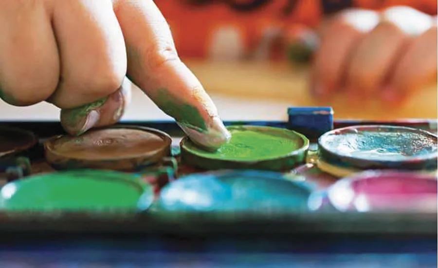
Perhaps no color is more primal than green. From the grass under our feet to the leaves on the trees to the rainbow in the sky, green surrounds us. A symbol of growth and energy, green also is considered a balanced color. In the rainbow as well as the visible light spectrum, green is close to the middle.
No color is closer to nature than green, yet it’s also the color of money and plastic toy dinosaurs, soda bottles and Starbucks logos. It’s the Green Monster at Fenway Park as well as The Hulk and Kermit the Frog. Green is associated with paradise – but also with jealousy, sickness, poison and, for a brief period, the devil.
All of which gives us a green light to explore this varied and diverse color.
Color Wheels Go ‘Round
On the electromagnetic spectrum (the range of all light waves, visible and invisible), green wavelengths fall between 492 and 577 nanometers. Bluish-greens are toward the shorter end of the range while more yellowish tones occupy the longer end.
Possibly because of its centrist location, green is considered the most restful color for the human eye. And, technologically, if you’re working at a computer or kicking back to watch some Netflix, green helps make your activities possible.
Without green, red and blue light mixing together in varying colors and intensities, we’d have no TV, colorful computer monitors or vivid video games. Mix all three colors equally and you get white. The system is known as the RGB color model and its components, including green, are considered additive primary colors.
But RGB is not the only color wheel in town. On the more traditional version, known as a subtractive color model, green is a secondary hue made from combining yellow with blue. The basics of color theory can help us appreciate the history of green in textiles and on canvas.
Green Art and Fashion – It’s “Killer”
For most of history, green pigments were difficult to produce. The best option for most applications was doing blue with a yellow overlay, or vice versa, and hoping for the best. Green also had no staying power. It faded and degraded, and corrosive paints burned through canvas, paper and wood.
Near the end of the 18th century, inventor Carl Wilhelm Scheele found that mixing arsenic and copper made green color hold. He called his concoction Scheele’s Green. It was vivid, assertive, colorfast and insanely popular. Everybody used it – for wallpaper, textiles, paints, hair ornaments, artificial flowers, wreaths, wax candles, children’s toys and a host of other items. It also looked great in both natural light and gaslight – important for a lady swishing her skirts to catch a gentleman’s eye.
Unfortunately, the arsenic was a bad idea. Scheele’s Green was both toxic and carcinogenic. The results were about what you’d expect – gross skin lesions, respiratory problems, vomiting, seizures, death. Green wallpaper is even suspected in the demise of Napoleon, who loved the color and used it on the walls of his room while in exile on St. Helena.
The “improvement” was no better. Paris Green, a compound of arsenic and verdigris, became popular for artist’s paint and wallpaper. Later, people found a far more effective use for it – killing rats in the Paris sewer system.
Green Psychology
Let’s turn our attention to greener pastures and consider the positive effects green can have on our brains.
Humans have a basic need for security, and green delivers. The lushness of certain shades communicates that we are in a fertile environment with plenty of water, food and warm temperatures. Seeing green lets us relax because we know we can survive.
A walk in the green outdoors changes blood flow within the brain. It soothes the mind; improving ADHD in children and helping city dwellers feel less moody and broody. Some studies have found that green improves reading ability and creativity. In design, green has a calming effect, slowing the metabolism and helping to relieve anxiety.
When a business or political group uses green, it’s telling us that its product or philosophy is good for us. Consider Whole Foods, Starbucks (except that the calories in those venti double-shot iced mochas can really add up), Greenpeace, Tropicana, Green Giant and even John Deere.
For more information, visit www.plasticscolor.com.
Looking for a reprint of this article?
From high-res PDFs to custom plaques, order your copy today!


