Pratt & Lambert Paints Announces 2018 Color Of The Year
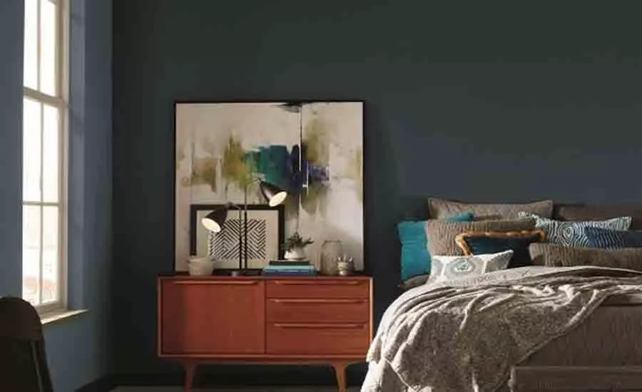
CLEVELAND – Pratt & Lambert® Paints unveiled Heron (27-18) as the brand's 2018 Color of the Year. This elegant midnight blue becomes the leading color from Beyond, Pratt & Lambert's full 2018 color forecast, which draws inspiration from today's cultural influences across fashion, technology, travel, art and home décor.
"The 2018 color forecast for Pratt & Lambert was created to take our customers on a journey through color, culture and design 'beyond' what they've explored before," said Ashley Banbury, Senior Designer, Pratt & Lambert Paints. "In our search for serenity in today's dynamic and often hectic world, we found Heron, our 2018 Color of the Year. It offers calmness, tranquility and adaptability, allowing it to transform an ordinary space into a sanctuary that truly showcases the power of color."
Found within Intention, the color trend story that encourages finding and experiencing the joy in slow, mindful living, Heron offers the calming effect that is sought out in daily life. It is a versatile blue that provides creative individuals, from interior designers to architects and design-savvy homeowners, an opportunity to create tranquil spaces in styles ranging from traditional to contemporary. In functional spaces, like living rooms, this statement blue gives a subtle visual impact with an aura of relaxation. It inspires unplugging and spending more quality time with family and friends.
Heron mixes well with crisp whites, soft grays and metallics and can be paired with materials such as whitewashed wood, burlap, concrete, terracotta and glazed pottery to further inspire relaxed living spaces.
The four trends that make up Pratt & Lambert's 2018 color forecast are Intention, Diverge, Boundless and Synthesize.
Intention inspires us to live with a mindset that is thoughtful and restful. Less is more in Intention, as homeowners decorate spaces that evoke memories of past experiences. Interiors are calm, decluttered and tranquil with soft and airy hues of gray and pink. The colors of this palette can be used to create spaces that bring tranquility and relaxation.
Diverge takes inspiration from the exploration of new worlds. Minimalistic colors and clean lines merge for a simple yet impactful design and interiors are modest — often featuring neutral colors. These neutrals are not always light in level, but can be deep and enveloping. The Diverge color palette features gray-greens that represent rare earth metals that are reflective of celestial violets. Neutrals like dune and smoke also play well in this otherworldly palette.
The possibilities are limitless with Boundless, a palette that provides consumers the opportunity to author their own design stories. Driven by uncategorized and authentic storytelling, the Boundless palette is energetic and colorful, merging neutrals with unexpected pops of color. This trend showcases bright hues like true red, cherry and orange that stands out against neutrals like greige and cream.
The colors of Synthesize represent the humanized version of technology. This story features vivid colors used to re-energize natural patterns allowing colors to blend, blur and bleed into one another. Interiors combine punches of color with patterns and texture. This palette includes hues inspired by fields of green and gold, violets, teals, and brilliant reds that stand out against gunmetal and steel blues.
For more information on Pratt & Lambert's 2018 Color Trends and 2018 Color of the Year, visit http://prattandlambert.com/color-and-inspiration/color-trends/.
Looking for a reprint of this article?
From high-res PDFs to custom plaques, order your copy today!


