AkzoNobel Announces 2018 Color of the Year
AMSTERDAM – AkzoNobel has unveiled Heart Wood as the much-anticipated Color of the Year for 2018. The selection follows continuous expert research into trends, insights and consumer behaviors.
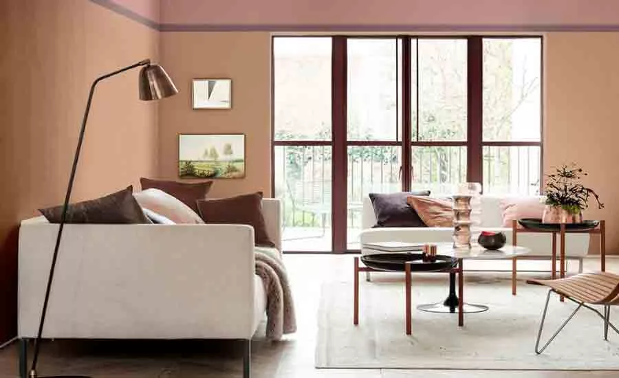
A subtle and warm tone of grown-up pink, Heart Wood draws from the tactile qualities of natural wood and leather, conveying comfort and ease in response to consumers wanting to nestle down more and create a welcome home.
Extensive research was conducted by the color team at AkzoNobel's Global Aesthetic Center, together with a group of 11 international experts. It revealed a strong overarching trend of consumers wanting to transform their homes into spaces of retreat from the outside world.
"As life gets faster, now is the time to press pause," said Heleen Van Gent, Creative Director at the company's Global Aesthetic Center. "Our home needs to be a place where we can turn down the noise, where we can nurture our values and recharge. Color can play a significant role in addressing the balance between outside clamor and inner calm.
"Our 2018 Color of the Year truly captures the mood of the moment. Heart Wood and its four complementary color palettes will help consumers achieve a home that is truly and uniquely theirs, bringing feelings of safety and reassurance and creating a welcome home for all."
The Heart Wood Home palette blends harmoniously with the materials from which the hero color takes its inspiration, while three supporting palettes balance softer shades with deeper and bolder tones.
The Comforting Home palette features warm earth tones, bringing together clay and blush pink tones to calm the mind, soothe the senses and shut out the noise. The Inviting Home palette brings comfort and convenience to life. Cool shades of blue encourage a clear-headed approach to life, while neutrals and fresh green support the need for connection with the outside world. Softer pastel shades are enhanced by coal and ink blue. The Playful Home palette creates a space to inspire and invigorate the senses. Yellow-toned green and gold encourage a creative approach to life. Pops of color add a sense of fun and energy.
2018 marks the 15th year of the development of the Color of the Year, based on the ongoing expert analysis of social, economic and design trends by AkzoNobel's Global Aesthetics Center. The Color of the Year is selected annually to help consumers make color and design choices with more confidence, especially when combined and integrated with innovative digital solutions such as the Visualizer, the multi-award-winning app designed to make decorating easier and more inspiring.
Looking for a reprint of this article?
From high-res PDFs to custom plaques, order your copy today!


