Methods for Describing Color and Effect
An overview of methods for matching paint color identifies three different types. A precise description of the respective method is important, particularly for effects with aluminum and interference pigments, since the effect is heavily dependent on the selected measurement geometries. Measurement geometry defines the combination of the illumination angle with that of the detector. This results in a color that is assigned exactly to this geometry. The three methods presented here are: visual matching at the window or in the light cabin; instrument-based measurement with the relevant portable devices; as well as the description of the optical properties.
At the window, the sample plate is held to the light and tilted up and down. The sample plate is also often held upside down, with the subjects standing with their backs to the light source. There are walk-in light booths where the assessment is similar to that at the window. In light booths that have a table or a work space, the test is made while sitting. Here, the sample plate is usually held in the ray path of the light source – usually high up in the cabin – and evaluated.
During assessment using instruments, a measuring instrument is placed on the sample plate. The sample plate is illuminated while measuring, and the reflected portions are measured. These physical values are then converted into physiological color values. The reflection curves are a valuable aid when evaluating paints with pigment effects. In particular, the reflection curves of interference pigments reveal a lot of information about the pigment and its optical performance.
Today, portable measuring instruments still work with these geometries complemented by the -15° geometry. Originally, these geometries were intended for measuring metallic coatings. In the late eighties, the use of interference pigments in emerging coatings was measured with the same devices and geometries, without taking into account the physical and optical properties of these pigments. The color and effect of aluminum and interference pigments are highly dependent on measurement geometry, i.e. the combination of illumination and observation. And that applies both to the visual and the instrumental assessment. Ideally, both methods should yield the same result. Finally, assessment by instruments is derived from the visual: the physical reflection value. The measurements by instruments are translated into physiological color values that reflect the visual impression. Nevertheless, the criticism is often heard from coating labs that observation at the window or in the light cabin does not correlate with the measurement results, particularly in the case of effect coatings. The contradiction is not due to the measuring methods’ inaccuracy or errors, or with conversions of the color values, but to the different measuring geometries used in visual and instrumental assessment. The selection of measuring geometries plays a decisive role for both assessment methods. In addition, the optical properties of the interference pigments call for a corresponding choice of measurement geometries.
The third method delineates the optical properties of a pigment effect. Out of this comes the need to identify and characterize them. For example, different types of aluminum pigments also have different ways of behaving. Interference pigments also behave according to optical principles. The comparison shows how the optical properties correlate with the other two methods.
Visual Assessment
When making a visual assessment at the window, the sample panel(s) are first positioned so that the observer is looking at the gloss. In this initial position, the gloss angle (= angle of reflection) is the same as the angle of the illumination, and the normal sits perpendicular between them on the sample panel(s). As an example, suppose that the angle of the illumination is +15° to the normal. Accordingly, the gloss angle is -15°. Here the angle convention is used, according to which the angles on the illumination side are designated positive and those on the observer side negative values, although according to the optical principle the angle of incidence equals the angle of reflection.
The observer now tilts the sheet or sheets upwards to themselves or down away from them. In all cases, the angle between them and the light source always remains the same, in this example always 30°. In the case of portable measuring instruments, on the other hand, the difference angle (aspecular) between illumination and observer changes with each measurement geometry.
If the observer tilts the sample sheet toward themselves, the angle of illumination increases. At the same time, the difference angle (aspecular) between the observer and the gloss angle increases. For example, if the illumination angle changes from +15° to +45°, the gloss angle changes from -15° to -45°. The angle of the observer is then +15°, which corresponds to a difference to the illumination of 30°. This results in a difference angle (aspecular) between observer and gloss of 60° (Figure 1).
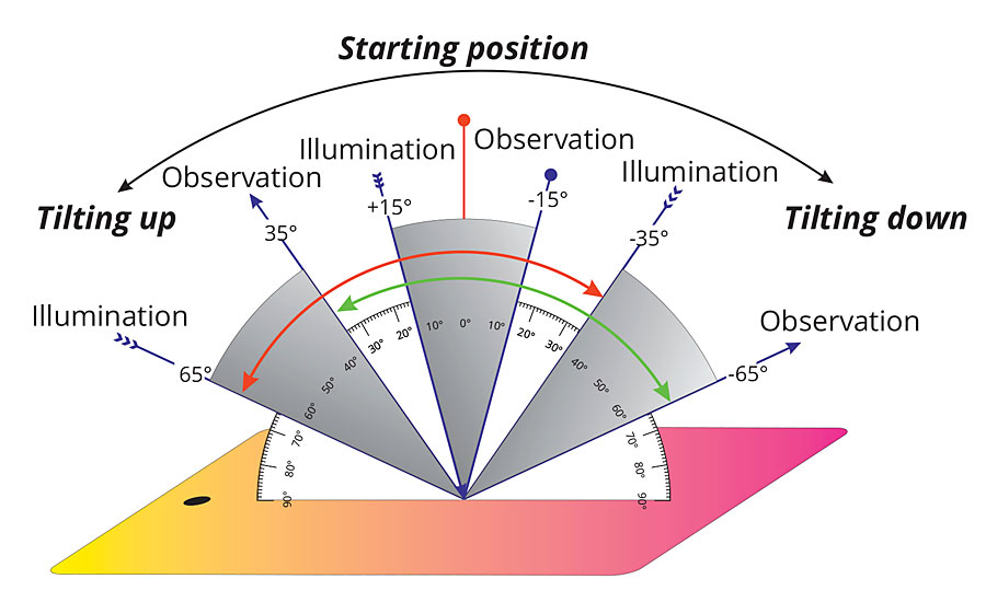
FIGURE 1 » In this example, the starting position at the window is +15° for illumination and -15° for observation, i.e. the difference angle between illumination and observation is 30°. Tilting a panel up and down, the difference angle stays the same.
If the panel is moved away from the observer and tilted down, then initially the illumination angle moves to normal, for example, from +15° to +5°. The corresponding gloss angle is then -5° and the observation angle -25°. This corresponds to a difference angle (aspecular) between observer and gloss of -20°. If the observer tilts the sheet down further, the angle of illumination moves to the normal and then changes sides, for example to -10°. The gloss angle then lies on the other side at +10°. The observation angle changes to -40° and the difference angle (aspecular) between observer and gloss is now 50°.
An important issue must be taken into consideration when tilting up and down: due to the light reversal, the color values are almost identical. For example, measurements of +10° illumination and -20° observation theoretically correspond to measurements of +20° illumination and -10° observation. If you take the measurement values when tilting downwards, you will notice that you get almost the same results as when tilting upwards. Differences are so slight to the eye that one perceives practically the same colors or the same color gradients. Ultimately, it does not matter if you tilt the sample panel up or down, you get the same color impressions (Figure 2).

FIGURE 2 » Due to optical laws you can reverse the light path: 45° illumination and -60° observation is equal to 60° illumination and -45° observation.
The differences are greater with drawdowns. This results in a preferred orientation, which becomes noticeable when measuring. The difference is small in sprayouts, but may depend on the quality of the spray application.
Other methods of observation yield the same results: if the sample sheet is held upside down and then tested with its back to the window, then the same conditions result when tilting forwards and backwards. Even in a walk-in light cabin you will find these conditions; other light cabins are designed according to the customer’s specifications. Here, the sample panel is often illuminated from above vertically or under 45° and then tilted forward and backward. The sequence of geometries is comparable (Figure 3).
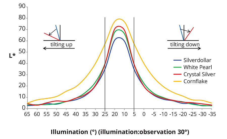
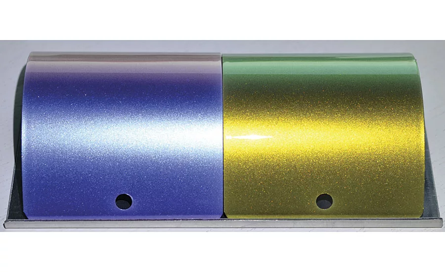
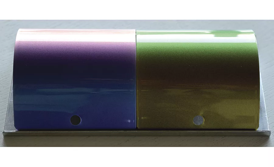
FIGURE 3 » Tilting a panel up and down shows the same lightness travel in both directions. According to the effect pigment in the formulation Ravenna Blue, the lightness travel is smoother or steeper.
One aspect of the visual checks should not be forgotten: the area of a sample sheet is significantly larger in contrast to the measuring spot of an instrument. At a normal distance from the viewer and with a normal size, the viewing angle between the top and bottom edges is approximately 20°.
The visual examination starts close up to the gloss; when tilting forwards and backwards, the observer continues to move away from the gloss, as their position to the window and lighting remains constant. The portable measuring instruments maintain the position of the illumination and the angle to the observation changes with each geometry. In the case of interference pigments, which have a more or less pronounced color travel, a different process is observed than the one that results from instrumental measurement.
Instrumental Assessment
Color effects and gradients, especially of interference pigments, are highly dependent on the geometries by which they are illuminated and observed. The fact that the portable devices use geometries that are different from those used in visual matching does not say anything about their quality. The choice of fewer geometries also limits the amount of data that comes with each additional measurement. Even the introduction of an additional geometry at -15° from gloss (aspecular) angle, as defined in the ASTM standard test method, has required a great deal of work from many users. What occurs in a measuring device and what the angle designations mean remains incomprehensible to many users even today (Figure 4).
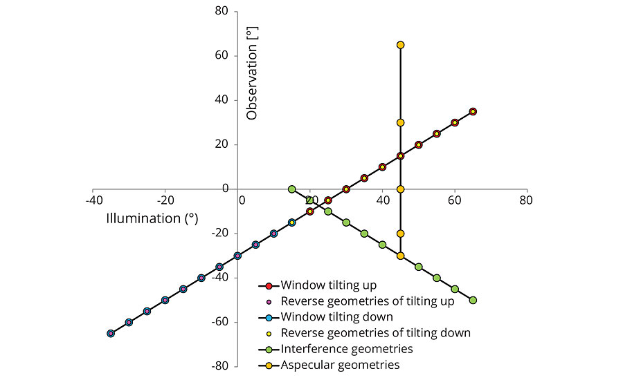
FIGURE 4 » Visual and instrumental assessment hardly match the optical properties (interference geometries). The aspecular geometries correspond to the geometries of portable instruments (X-Rite MA98, BYKmac, KonicaMinolta CM-6).
A coating infused with color pigments shows little or no color travel; an aluminum-pigmented coating in particular has a glossiness because of changes in lightness when the measurement geometries change. Its gloss is at its brightest close up and decreases the further away you get. This behavior can be described using portable devices. The detector moves away in bigger and bigger steps from the gloss angle at a constant illumination angle. In this way, special phenomena can be recorded that are visually described with other geometries. An example of this is blends with carbon black pigments: as fine-particle pigments they are bluish, as coarse ones, they are brownish. When mixed with the same aluminum pigment, the mixture of bluish carbon black is much darker than the mixture with the brownish when looked at close up to the gloss. The lightness ratio changes depending on the distance from the gloss: the mixture with the bluish carbon black becomes lighter than the mixture with the brownish. This behavior can also be detected in mixtures with interference pigments. The change in lightness can be described both visually and using instruments.
An advantage for instrumental assessment over the visual can be seen in the color properties of colorful, transparent interference pigments: if a corresponding coating is applied to a white background, the change from the reflection to the transmission color is recognizable. These pigments have a typical reflection color on their surface; light rays that penetrate the pigments generate a complementary transmission color on the back due to the missing phase shift. The constant illumination angle of the measuring instruments as well as their change from the difference angle (aspecular) to the gloss ensure the correct description of this optical property: between the difference angles (aspecular) of 20° and 30° there is an intermediate area in which change takes place, depending on the type of pigment.
Portable devices display part of the color properties of a coating and its pigments with their selection of geometries. Visual matching shows a different part of the color properties and can therefore give different results. Therefore, it is important to combine both outcomes to make an optimal assessment.
Properties of Interference
The third aspect of color assessment deals with optical properties. These are initially independent of the described methods of visual and instrumental color inspection. The description of properties raises the question of whether and how they can be adapted to those methods.
Aluminum pigments change their lightness when illuminated at different angles with the same difference angle (aspecular). They also change their lightness when observed at fixed illumination angles with different aspecular angles. Looking at the corresponding reflection curves, a change in the level of reflection is noted, but no displacement.
According to the principles of interference, interference pigments react to the change in angle of the illumination. With the same aspecular angle, the reflection curves shift to shorter wavelength when the pigment or the corresponding coating is illuminated more evenly, i.e. red interference pigments shift to yellowish, yellow interference pigments to greenish and green to bluish. Measurements with changed illumination angles clearly show this behavior in both the reflection curves and the a*b* color values.
The behavior is typical for each interference pigment and can also be used for identification. The characteristic anchor shape formed by the interference line with the measurement geometries 15°/as15° - 45°/as15° - 65/as15° and the aspecular line with 45°/as15° - 45°/as25° - 45°/as45°, is specific for an interference pigment. In the connection of 45°/as25° - 45°/as15° - 65°/as15°, the arm always points 45°/as15° - 65°/as15° counterclockwise (Figures 5 and 6).
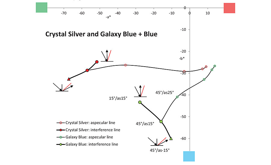
FIGURE 5 » The interference lines show the typical reaction of the white and blue effect pigment: the extension of the axis 45°/as15° - 45°/as25° goes straight on with white or silver-white pigments. Color pigments (interference pigments) bend counterclockwise.
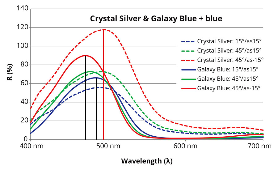
FIGURE 6 » Reflectance curves of color interference pigment shift to shorter wavelength when illuminated flatter. Reflectance curves of white interference pigments just increase without any color shift.
These geometries cannot be realized using portable devices; due to the principles of light reversal, the 45°/as-15° geometry can be used instead of the 65°/as15° geometry. It is illuminated at 45° and observed at -60° (corresponds to -15° aspecular) with this geometry. If you reverse the light path, it is illuminated at 60° and observed at 45° (corresponds to 15° aspecular); 45°/as-15° corresponds to 60°/as15°. The optical properties of an interference pigment can be partially captured using this “trick” (Figures 7 and 8).
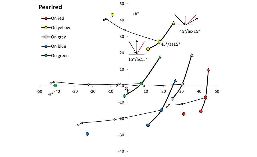
FIGURE 7 » The interference line is typical for a pigment. Different colors of primers/underground shift this interference line.
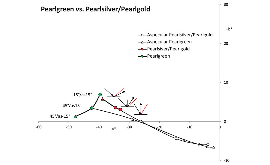
FIGURE 8 » The geometries of portable instruments represent just the aspecular lines. Only the interference lines inform about different pigment formulations.
Summary
All three descriptions have their merits: visual assessment is more like the human behavior of moving the sample sheet back and forth (Figure 9). In most cases, two sample sheets are compared to detect color differences. Color differences can also be detected with the portable measuring instruments as long as they occur with the given measurement geometries. The optical properties require different measurement geometries to characterize and differentiate interference pigments. If you want to assess them visually, it is recommended you move the measuring panel in a parallel fashion from top to bottom while simultaneously changing the illumination angle. If you hold the sample sheet up and look over it, it should also be illuminated evenly. If you lower the sheet, it is illuminated and observed to be steeper and steeper. If you want to achieve similar results with portable measuring instruments, the 45°/as-15° is included in the assessment. Colorful interference pigments “bend” the arm from 45°/as15° -45°/as‑15° counterclockwise, while aluminum pigments run straight in relation to the arm from 45°/as25°- 45°/as15°.
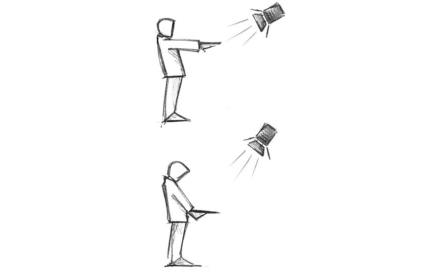
FIGURE 9 » For visual assessment of interference pigments/panels you should move the panel up and down without tilting. You start with flat illumination and flat observation, and move in parallel downwards. In this way you change the angle of illumination while observing near gloss.
Looking for a reprint of this article?
From high-res PDFs to custom plaques, order your copy today!


