The Power of Color for a Post-Pandemic Recovery

The pandemic, and its effects, not only altered our lifestyles and business models, but also highlighted the role and need for color in our lives. This reality manifested on various levels in medical, governmental, residential, commercial and industrial environments, either physically or virtually.
From color-coded tiers to signal COVID-19 restrictions, to the application of color bursts to our private spaces, and the most recent color-coded sticker system to indicate the degree of physical contact accepted at in-person events, our appreciation for color and its impact received a real boost.
During lockdowns, the long hours we spent facing familiar objects and walls as the backdrop to our computer screens have amplified the monotony of working from home and physical distancing experiences. Remote education allowed parents to recognize that children needed chromatic spaces in their home-schooling environments. The use of face coverings amplified the necessity to accentuate the visible areas of the face with colors that suggested we are still alive behind our canopies.
Our collective pandemic experiences raised our collective awareness about the significance and impactful power of color for our mental and physical health. Because color is a manifestation of our human psychology, it can modify our moods, change our perception of time, alter our sleeping and eating habits, and work to our detriment or benefit.
Cautiously, but expediently, we began adjusting our daily venues to create, with a splash of color, friendly and cheering environments. We started designing with uplifting hues and nature-inspired colors to transform our personal spaces into warming refuges that provide a sense of hope and security.
2022+ Color Direction
Color Marketing Group® (CMG), which is celebrating its BIG SIXTIES anniversary this year, unveiled its 2022+ World Color Forecast™ (WCF) in November 2020 during its first Virtual International Summit.
Resulting from the collective research of its members and guests that came together at the height of the pandemic at 17 virtual, international ChromaZone® Color Forecasting Workshops, CMG’s color direction for 2022 includes 64 colors associated to macro trends influencing 12 color stories representing four regions. These color stories tackled the co-existence of the digital and the real worlds, truth and science, climate change, personal growth and resilience, social transformation, and finding our inner voices.
As the year unfolded, many of CMG forecasted colors already emerged in numerous market segments. It is not unusual to see colors debuting ahead of their expected appearance because color trends do not end with the end of a calendar year or start at the beginning of another. Colors emerge in the market when consumers start embracing them. They can turn up earlier than forecasted or continue to trend longer than predicted.
For 2022+, CMG anticipated the importance of yellow and purple, as well as green and blue families ranging from pale, tinted neutrals to bright, saturated hues.
Green will be prominent in many market segments. Green will make a comeback in the kitchen, the bathroom, the living room and other unexpected spaces to promote balance, renewal and a sense of stability that we need during the healing process as we slowly adopt new post-pandemic lifestyles.
Blue is predicted to trend in various saturation levels and with an intensified green or red influence, providing an almost purple appearance. Traditionally, blue is representative of clean water and the skies. Going forward, blue will also represent virtual and space travels, as well as new beginnings.
Yellow and Purple Emerge Simultaneously
While the general attitude toward yellow oscillates between restrained admiration and deep popularity, yellow is associated with optimism. In his 2019 book “Yellow: The History of a Color,” Michel Pastoureau pondered if yellow could be “the color of the future.” Though purple is an ambivalent color and evokes a sense of ambiguity because it combines the stability of blue and the passion of red, it stimulates the part of the brain related to creativity and can be both encouraging and calming to the mind and nerves.
Up until recently, purple has had different connotations. However, over the last 10 years, the color has marked a fascinating evolution, from being associated with royalty, wealth and spirituality to becoming attached to technology. That is remarkable because it represents two extremes. The first time CMG Color Forecasters associated purple to cloud technology was for 2012+. In the years that followed, the symbolism of purple overlapped between classic technology and modern online gaming. In present times, purple is associated with digitalization, technology, cyberpunk, FinTech and space exploration.
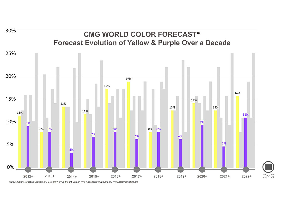
Because of their uplifting and calming effects, yellow and purple usually emerge at the same time during or after difficult times. An analysis of a decade of CMG WCF showcases the correlated emergence of yellow and purple following the financial crisis of 2008 and post-pandemic 2020 (Figure 1).
Because color is interpreted differently by different cultures, CMG Regional Color Forecasts are a manifestation of the differing regional considerations arising during the forecasting process.
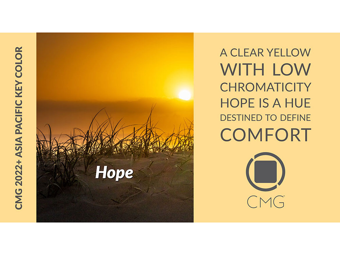
CMG 2022+ Asia Pacific Color Forecast
For Asia Pacific, the color direction for 2022 includes yellow-influenced reds with orange aesthetics. Purple develops into a forward hue expressing the search for new beginnings, as new generations continue to engage in the quest for fairness to protect the future of the planet.
Parting with traditional saturated colors, a new trend of low-chroma, tinted neutrals will emerge as a frontrunner in many countries of the region. These tinted neutrals will interpret old-style traditions in new manners and highlight the emphasis on a future expected to bring healing and wellbeing to all.
CMG 2022+ European Color Forecast
In the European region, the color direction deviates from previous years. Traditional, rich reds, oranges, dark browns and blues will give way to less saturated yellows, cautiously signaling there’s light at the end of the tunnel in a region eager for transparency and constancy.
Stimulated by the increased consumption of virtual reality, at one end, and motivated by the need for digital purification, at another, purple reappears in the European Forecast referencing the duality of our post-pandemic world. The purple family is extended by bright, tech blue hues that display a purple quality. They call for clean water, clear skies and new beginnings.
CMG 2022+ Latin America Color Forecast
The traditional bright red, orange, green and blue colors we are accustomed to seeing in Latin America will diverge to debut an unexpected color direction, consistent with what we typically anticipate for North America and Europe’s Color Forecasts. The shift could be attributed not only to macro influences on color and design, but also to the important position the continent is forging for itself in the global arena as a developing, design-forward marketplace.
The Color Forecast includes pale, clean and restrained yellows, indicating calmness and purification, and manifesting the energy running through our veins to keep us afloat. The saturated vibrant reds fade away to allow the release of balanced, muted, modern and unassuming reds, representative of the beating of our hearts.
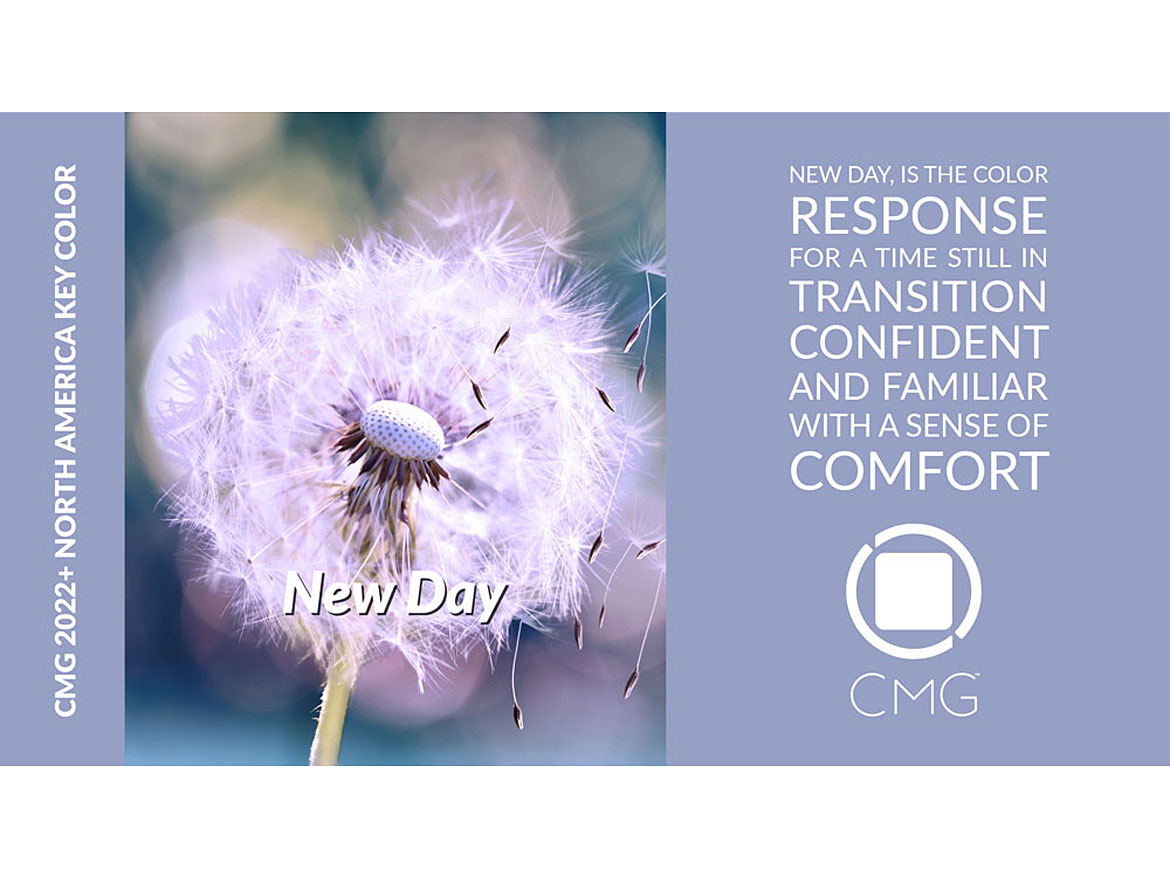
CMG 2022+ North America Color Forecast
Dominated by green, blue and purple, the North American Color Forecast reveals a surprising upward direction of bright and vibrant colors. The blue and green hues are influenced either by red and yellow or collide between each other, allowing verdigris or light emerald tonalities to come forward. They cross the frontiers between personal emotions and physical communities, bridging them together.
These colors will be balanced by softer, tinted neutrals, whispering low tunes of courage, resilience and hope. They bind us to the ground and promote respite as we cross the uncharted waters towards the future.
Yellow will make a leap from a pale aesthetic in 2021 to an optimistic, higher chroma in 2022. This shift signals our symbolic rebound and the importance of hope, boldness and new opportunities. Similarly, orange gets injected with high doses of red personifying perseverance and innovation.
Bright, bold pink and magenta colors become important as a new take on empowerment to recognize how science is shaping our world.
CMG 2022+ Key Colors
The Key Color for each regional CMG Color Forecast is indicative of the importance of the color family to the Color Forecast, the significance of the specific color to the color direction, and how the color best represents the general mood of the color stories.
For 2022, CMG Key Colors convey a message of hope and renewal. See below for these colors and their descriptions.


I will examine CMG’s 2023+ World Color Forecast™ in the February issue of Paint & Coatings Industry (PCI) magazine.
Looking for a reprint of this article?
From high-res PDFs to custom plaques, order your copy today!


