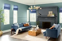
Sico Paints Unveils 2010-2011 Color Forecast
Move over neutral color schemes. Livelier hues will be making a comeback in home décor in 2010-2011, and it’s all about using color as a mood lifter in the midst of challenging times, according to leading Canadian paint brand Sico Paints.
LONGUEUIL, Canada – Move over neutral color schemes. Livelier hues will be making a comeback in home décor in 2010-2011, and it’s all about using color as a mood lifter in the midst of challenging times, according to leading Canadian paint brand Sico Paints.
“During the past years, Canadians have opted for comforting, warm neutrals like browns and beiges as a result of an uncertain economic, political and environmental climate, but now people have had enough with doom and gloom and are looking for a change, a new beginning,” said Stéphanie Pelland, Marketing Communication Manager for the Sico brand and member of the international color forecaster Color Marketing Group. “In 2010-2011, we’ll see a trend toward consumers choosing livelier colors to reflect their optimism in their quest for a brighter future.”
Colorful hues such as deep reds and purples, vivid blues and greens, pigment-infused pastels such as baby blues and pinks, and earthy golds and clays will be among the new colors featured in next year’s palette.
The 2010-2011 palette will be divided into four themes. Sico’s 2010-2011 color groupings include Back to Basics, Free Expression, Classic Revival and Synthetic Culture.
Representing the growing population that is finding refuge in a return to the simplicity and tradition of the past, Back to Basics features down-to-earth mid-tones in gold, plum, green moss, teal and red clay. The timeless authentic look of this palette represents the reclaiming of a balanced lifestyle, deep-rooted home and family values, and confidence in a stable and sustainable tomorrow.
Exuding a sense of optimism, individuality, rebellion and freedom, the Free Expression theme is reflected in the 2010-2011 color palette through creative color combinations. This palette represents young people who use social media and other creative means to express themselves. It translates into unique color mixes, including intense purple combined with acidic yellow and ocean blue, as well as sunny orange with dark red and soft neutral. Added to this decor of unconventional color blends will be the use of mismatched patterns, styles and materials.
The Classic Revival theme features a feminine group of colors that invokes images of décor elements that are rich in history. Imagine needlework, appliqués and period furniture that are being revisited by designers with a contemporary twist. This theme is reassuring, comforting and emits an air of soft elegance. Highlighted by ash-like purple, antique pink and gold, the classic palette is enlivened and made more contemporary by the addition of deeper colors like pewter grey, bronze green and lacquer reds.
The Synthetic Culture theme features dynamic, energetic colors, representing consumers’ growing appreciation of the artificial elements around us. Recognizing our planet’s depleting resources, society has been forced to merge science with art and experiment with unnatural, engineered materials in creative ways; this theme celebrates these innovations. Its acid-fresh palette features lively purples as well as pulsating pinks, yellows and blues. It mirrors the popularity of unique synthetic, futuristic home products that feature ultra-smooth lines and curves.
Looking for a reprint of this article?
From high-res PDFs to custom plaques, order your copy today!


