The Strategic Value of Color Forecasts

- How CMG’s long-range color forecasting differs from single-year trend programs.
- Why directional key colors support portfolio and R&D decision-making.
- What CMG’s 2027+ forecast reveals about global and regional color alignment.
In a recent article I wrote for the Italian magazine Finiture Green, I emphasized that “walking blindfolded through a dark tunnel is hardly a viable business strategy, yet this is often how many companies still approach color. They wait for trends to appear, reacting instead of leading, and miss the opportunity to anchor their products and spaces in hues that resonate with consumers’ experiences.”
What I meant is that when we see a color trend in the market, it’s already too late for a company to catch up. For a business strategy to be complete, the color portfolio must be a central strategic element. However, I’m not talking about your current color offering. I’m referring to your forward-looking palette, the one that is driven by researched societal, environmental, and technological insights. The portfolio that we call “color forecast”, your roadmap to constructing a reliable image of tomorrow’s consumer color preferences.
A strategic approach to color helps companies anticipate market shifts rather than react to trends. Proactive color forecasting supports long-term relevance with consumers and users alike. Color also plays a role in durability, adaptability, and sustainable material choices, an increasingly critical consideration in responsible design.
A well-structured color strategy is essential for user engagement, competitive edge, brand recognition, permanency, and sustainability. In architecture and interior design, color not only concerns human perception or help delimit space utilization, but it also supports the sensorial and emotional experiences we build with space and how those spaces make us feel. In retail, hospitality, or workplace environments, for instance, thoughtful palettes influence purchasing decisions, well-being, and productivity.
During my conversation with Courtney Bassett, Chief Editor of PCI Magazine, on the Coat It! Podcast, we focused on the value of long-range color forecasting for pigment suppliers, paint and coatings manufacturers, specifiers, and adjacent industries. We discussed how Color Marketing Group® (CMG) annual color forecasts are not about hues we like, but rather a strategic tool to guide R&D priorities, manage portfolio gaps, and even fuel more meaningful conversations with clients.
Listen to a two-part Coat It! podcast series with Montaha Hidefi exploring Color Marketing Group®’s long-range color forecasting and its implications for pigment suppliers and formulators.
I have been a CMG member for almost twenty years, and my affiliation with this association has informed and supported my color decisions during my time in both the powder coatings and specialty effect pigments industries, as well as in my consultancy business. Now, as I serve on its Executive Committee as President, I consider the organization as a custodian of color directionality. Why? Because CMG expert work is collaborative and grounded in the foundational research conducted by its members. The forecasts are built by professionals across industries and regions who bring real-world insights from design, architecture, manufacturing, pigments, coatings, and materials. The outcome of the forecast, shared with members, is not a headline color, but a strategic framework that supports better long-term decision-making.
Each of the four CMG regions issues an annual Regional Forecast composed of 16 directional colors looking two years ahead. Together, these form the CMG World Color Forecast™. By “directional,” we mean that we do not dictate, but propose. Directional colors capture the imprint of societal shifts and can be adapted to each industry, market, and geography. Within the 16 colors, a regional Key Color is detected.
The identification of the Key Color is based on the overall color direction of the forecast, the relevance of the color family, the significance of the specific hue within that direction, and how effectively it represents the trend stories or the general mood of the forecast. The Key Color is not to be confused with “Color of the Year”, and it is not about claiming color authority, but about offering guidance that evolves from assertion to informed leadership. The Key Color is always tied back to context and emotion.
For CMG’s 2027+ World Color Forecast™, we observed a strong global alignment around themes such as digital fatigue, the need for emotional grounding, and a renewed focus on protection and adaptability. We also noted a clear tension between high-tech futures and a desire for what feels familiar and human.
For the first time since 2011, the year CMG adopted the notion of key colors, a strange and remarkable synergy occurred. Three of the four regions recognized green as the Key Color. I called this a “key planetary alignment” for its one-of-a-kind manifestation.
And though the regions identified green, the color was expressed differently. Two regions leaned into softness and shelter, while the third one responded with bolder, more expressive color as a form of resilience and identity. While the signals were regionally shared, the emotional responses were distinctly local.
Here’s an account of each of the Regional Key Colors.
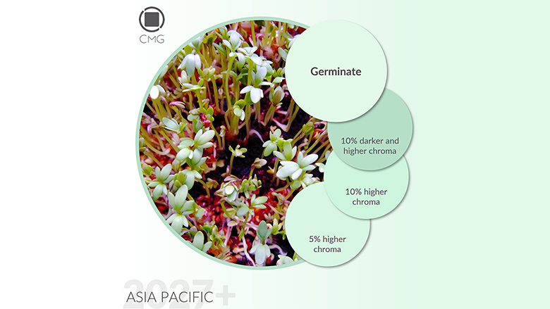
Asia Pacific Region | 2027+ Key Color: Germinate

The 2027+ color direction for Asia Pacific uncovers a collection shaped by introspection, renewed authenticity, and the recalibration of emotional and technological narratives. This is marked by a restrained optimism that favors psychological depth and calm energy, reflecting the region’s shifting priorities amid sensory overload and digital saturation.
For Asia Pacific, green assumes a moderate stance, an evolution toward quieter, more contemplative shades. Enter Germinate, a soft, low-chroma, true green with clear water qualities and a delicate, cheerful tone. Germinate was selected as Key Color for its symbolic resonance with the cultural and technological shifts shaping our future.
Like the first spring sprouts, Germinate hints the emergence of new life, inclusive of human and bionic beings. In any iteration of the color, whether darker shades or pale tones, Germinate reflects the surfacing of a new, unbiased consciousness, one that embraces subjectivity and freedom from judgment while remaining deeply connected to cultural and historical roots.
Since it’s a color that resonates with both human and bionic evolution, Germinate is expected to be adopted for various interior and exterior applications like paint and coatings, health and wellness, consumer and sporting goods, fashion and even robotics. It’s a dynamic tone with big possibilities.
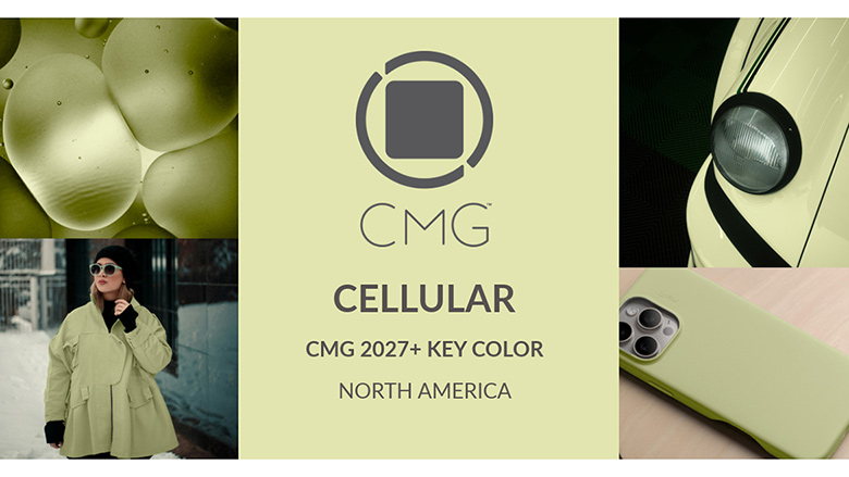
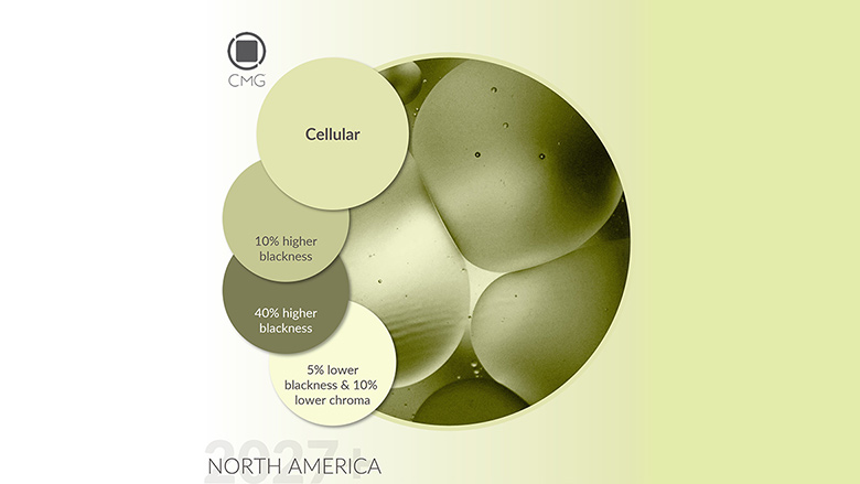
North American Region | 2027+ Key Color: Cellular
The direction of color for North America 2027+ reveals both an evolution and recalibration of recent forecast. Driven by economic restraints, shifting values, and a yearning for clarity, the forecast balances guarded hope with pragmatic realism. While certain hues reemerge with newfound strength, others subtly reposition, marking a shift where clearness, regeneration, and emotional grounding take precedence over novelty.
Green will continue to evolve as a vital hue with layered meanings. From ambivalent identity to regenerative glow and up to a promise of shared cultivation, green reinforces its position as a directional anchor proclaiming dominance for 2027 and beyond. However, the spectrum shifts from mordant or acidic tones to grounded, nurturing shades that signal purpose-driven growth, biotechnological advancement, and climate-conscious thinking.
To interpret these notions, Cellular, a nuanced, low-chroma, pale green with yellow undertones was picked as the Key Color. Cellular is a symbolic metaphor for solar-agricultural synergy and bio-driven innovation and recalibration. It’s a color that doesn’t shout but softly hums with meaning. Its delicate yet active aesthetic whispers that something new is incubating beneath the surface.
Cellular mirrors the tone of the forecast itself, soft, responsive, and rooted in the interplay between biology and technology. In any adaptation, whether darker or paler, higher or lower chroma, Cellular captures the collective craving for emotional, ecological, and creative restoration. It suggests that progress doesn’t always have to be radical or loud to be transformative. It reminds us that the most powerful changes often begin invisibly, cell by cell, idea by idea, until suddenly, they’re everywhere.
From an application perspective, Cellular is adaptable to an extensive range of industries, including commercial and residential interiors, automotive, appliances, sporting and consumer goods, consumer electronics, fashion, accessories and visual communications.
European Region | 2027+ Key Color: Endorphin

Europe’s 2027+ color direction implies a continued movement toward self-expression, sensory recalibration, and psychological grounding. As a hue, green undergoes a surprising transformation. Unlike previous forecasts where it leaned toward recycled and subdued aesthetics, the future embraces radiant newcomers marking an evident break from the past with bold expressions of energy, inner balance, and renewal.
Given that endorphins are naturally produced to relieve pain and elevate well-being, Endorphin was particularly chosen as Key Color to reawaken with intelligence, determination, and an open heart.
A medium chroma, clean green with a delicate pinch of yellow, Endorphin is vibrantly luminous. Instantly evoking freshness, it’s the color of vitality and mood regulation, releasing an energizing bloom that feels both familiar and future-forward.
With its crisp and dynamic brightness, Endorphin is a symbol of nature’s renaissance, and it channels the emotional lift we experience when we reconnect with purpose, joy, and movement. In paler or darker editions, the tonalities of Endorphin evoke the sensation of early spring, the burst of new leaves, the shimmer of dew on grass, and the dappled light cascading through forest canopies.

A color in motion, Endorphin flows like a fantasy across applications, making it ideal for sport vehicles, sporting goods, consumer electronics, fashion, accessories and more. It is equally effective as an accent or trim, where its luminosity can add an uplifting edge. In every context, Endorphin points to a shift toward emotional elevation, conscious energy, and organic progress.
Latin American Region | 2027+ Key Color: Pulso

The directionality of color for Latin America 2027+ is deeply entrenched in emotional resonance, culture, and technological advancement. Colors surface as symbols of calculated living and human-machine synergy, reflecting the region’s dual pursuit of emotional transparency and innovation.
Orange stands out in the forecast for its earthy, soil-connected hues tied to the continent’s heritage. For this, Pulso, a medium chroma, yellow-based, golden orange was chosen as Key Color to express the rhythm of life itself. Depending on application, Pulso can be interpreted through more than one iteration, to become browner, paler or even more pastel-like.

Like a heartbeat, Pulso rises and falls, repeating our inner tempo and the pulse of human connection. And like the vessels that circulate life, Pulso connects us across time and space. It speaks to our collective awakening and reflects the tension between the speed of modern interactions and the deep desire for genuine presence.
Pulso is foreseen as a versatile color that is adaptable to multiple sectors, ranging from exterior applications like automotive, architecture, recreational and sport vehicles, to interior applications for commercial and residential markets, consumer electronics, sporting and consumer goods, fashion and visual communications.
Key Planetary Alignment
Though three of the Key Colors fall within the same hue, aesthetically they show dissimilarities. While Asia Pacific opted for a soft, pure green with cool water qualities, North America selected warmth with yellow undertones and soft qualities. In contrast, Europe picked a bright and intense color, but still warm with yellow nuances.
I was asked how three regions, miles apart, could land on the same color family without sharing insights? The answer is simple and extends beyond coincidence. First, these selections represent the parameters that rule the Key Color identification which are based on the relevance of the color family, the significance of the specific hue within the color direction, and how effectively it represents the trend stories or the general mood of the forecast.
Beyond these parameters, what we notice is an increasingly synchronized forecast which reflects the erosion of cross-geographical boundaries and confirms that the drivers shaping societal lifestyles and consumer preferences are more converged than ever. Moving forward, we will continue to see more global synergies in consumer color preferences.
About Color Marketing Group®
Founded in 1962, Color Marketing Group® is a global, not-for-profit association of color professionals across design, manufacturing, architecture, pigments, coatings, and materials. Its strength lies in the diversity of its membership and the depth of research contributed by professionals actively shaping markets rather than observing them from the sidelines.
CMG’s forecasts are not trend reports in the conventional sense. They are strategic tools grounded in collective intelligence, designed to support long-range planning, informed innovation, and confident decision-making for organizations navigating increasingly complex global ecosystems.
Listen to a two-part Coat It! podcast series with Montaha Hidefi exploring Color Marketing Group®’s long-range color forecasting and its implications for pigment suppliers and formulators.
Looking for a reprint of this article?
From high-res PDFs to custom plaques, order your copy today!