60 Years of Color Forecasting

Thomas Robin, iStock / Getty Images Plus, via Getty Images

The 2024+ Asia Pacific Color Forecast

The 2024+ European Color Forecast

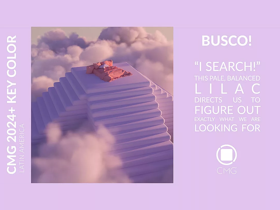
The 2024+ Latin American Forecast

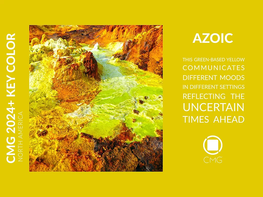
The 2024+ North American Color Forecast
Last November, Color Marketing Group® (CMG) members and guests gathered at CMG’s International Summit in Tuscan, Arizona, to celebrate CMG’s 60th anniversary. Along with the reveal of its 2024+ World Color Forecast™, a number of international guest speakers bolstered their topics with hands-on workshops to cast new light on color, material, and finishes as the color and design community comes out of the pandemic and progresses into a decade swayed by intensified environmental concerns, augmented technological advancements, conflicting political opinions, and the effects of economic downturns.
Jennifer Thompson of Deviant Thinking tackled radical innovation and the neurological reasons inhibiting innovative thinking. Fritz Horstman, education director of the Josef and Anni Albers Foundation situated Josef Albers’ use of color in the ongoing evolution of color thinking. Brian Horn, cinematic director supervisor of Blizzard Entertainment revealed the subjectivity of color in animation and games. U.K.-based, internationally recognized authority in materials and their application in design, Chris Lefteri, challenged the audience to think about materials from an emotional perspective. CMG Consultant Laura Perryman of Colour of Saying, also from the U.K., underlined the concept of ethical and sustainable color followed by a live exhibit to help understand how color fits into the circular thinking and circular economy frameworks.
CMG’s 60th included a keynote presentation delivered by Doty Horn of ColorVoyant and myself, in which we revealed the results of comprehensive research of CMG’s color archives. We distilled the drivers and most forecasted colors for each of the last six decades, the colors that crossed over the decades, the colors cycling forward, and the color families representing 60 years of color forecasting and design preferences. Our research was rounded off with the launch of Six Decades of Color, a print color card that includes the top 55 forecast colors of all time.
Speakers’ presentations were recorded, and CMG has made the recordings available. Interested audiences may contact CMG (sgriffis@colormarketing.org) for information on how to watch the recording and how to acquire the color card.
CMG 2024+ Color Direction
Understanding the color shifts from one year to another is a critical component of the work that designers, specifiers, applicators, and manufacturers do to introduce their products and services into the market in consumers’ and buyers’ color preferences. Because of its globally based membership, CMG has provided reliable color insights to the multi-level, color decision makers for six consecutive decades.
CMG’s outlook for 2024 reflects an organic progression of color forecasted in recent years. At the expense of warm yellow and orange colors, CMG predicts that cool hues will continue their ascendancy in various regions of the world, with blue and green leading the forecast. Tinted neutrals will maintain their upward progression in warmer tones even in regions conventionally dominated by strong, chromatic hues.
As could be expected, this global color pathway reinforces the notion of the globalized aspect of color directions documented in the few years leading to this decade. The pandemic years, responsible for the emergence of parallel socio-political, socio-economic, and technological macro trends, on a large scale, have accentuated this progression of color and design preferences on a micro basis. The sense that we all shared, and will continue to share, similar experiences has left its imprints on color directions.
When it comes to product and service development, the evolution and expansion of digitally consumed color will continue to challenge the color and design community in the quest to adopt science-backed tools for color communication and ensure color accuracy throughout the entire value chain, physically and virtually, in the metaverse.
Freshened Color Direction for Asia Pacific
The 2024+ Asia Pacific Color Forecast is motivated by the notion of connection. The odds are in favor of behaving differently from the way we did during the height of the pandemic years. Caring for the planet entails relying on new innovations, improving supply chain management, and reconnecting globally with a keen sense of urgency. The forecast characterizes this distinct behavior we aspire to attain.
The forecast projections are for non-typical, pale colors, with a clear shift from warm yellow and red to fresh blue and green hues. The persistence of yellow-based greens in the forecast conveys a deep message for reconnecting to the planet and concentrating on bringing healing to the environment. They call upon balance and well-being. The prevalence of red-based blue builds a link to technological advancements and the metaverse, with focus on connectivity.
The concept of connectivity is emphasized by the selection of the blue, Connection, as the Key Color for the region. Connection is a medium chroma, rich, red-based, dynamic color that depicts the integration and connection of the virtual world with our awakened reality. It is a symbol of new innovations and represents communication and connectivity. While a part of us seeks to escape our day-to-day routines and stresses through either virtual worlds or in nature, there is another part that seeks a deeper connection with our neighbors and community. Connection is a versatile color projected for commercial interiors, consumer goods, textiles, and visual communications.
Polychromatic Color Direction for Europe
The 2024+ European Color Forecast is driven by ecological concerns, supply chain issues, and restrictions on freedoms in a world overtaken by the bigger brands where everything seems alike.
The forecast foresees a broad range of color properties, including saturated colors that instill energy and inspire collaboration and desaturated tones influenced by plant-based and natural pigments. The forecast contains a balanced proportion of warm and cool hues, with red-based blue and various tonalites of intense and ocher orange projected to lead color preferences in the region.
The region selected a high-chroma, bright orange, Follow Me!, as its Key Color to mark the merits of warm colors and highlight the significance of adapting personal lifestyles and adopting sustainable habits. Follow Me! sends signals associated with our awakening as we let go of old structures. It is a color for communication and symbolizes the need for empathy, warmth and caring for people in need. It reflects the current struggles anticipated to continue in Europe. Follow Me! is a way forward in a world that is stressed. It focuses on action. It cries out for attention without aggression. It says, “follow me and we will seek a way out, together.” Follow Me! is foreseen to appear in markets such as consumer goods, sporting goods, and automotive exteriors.
De-Saturated Color Direction for Latin America
The 2024+ Latin American Forecast is steered by the accelerated technology growth rate and its augmented role in our lives. This growth is paved by the reality of the metaverse, and the challenges to identify how technology cohabitates with the multiple cultures forming the social fabric of the region.
The forecast points to a radical shift in color preferences for the region with the prevalence of low-chroma, pale, soft colors, predicted to overthrow long-established and notoriously strong, intense colors. This shift is inspired by nature and natural resources.
Fresh green and blue hues dominate the forecast. The upsurge of green may be attributed to the need for natural greens as we transition out of the pandemic. The direction for green marks a shift from traditional citric, acidic greens to the benefit of bright, fresh, natural foliage tones. This is determined by the influences drawn from the real into the virtual world, or the real into the virtual verse.
In support of the digital evolution occurring as the metaverse converges and diverges with the feelings of detachment and indifference, experienced during the times of pandemic, the color Busco! was selected as Key Color for the region. Busco!, Spanish for “I search,” is a low-chroma, pale, and balanced lilac, rising to emphasize the relationship with the metaverse. We are being forced to find new lifestyles in a hyper-connected world. This is resulting in a cross-pollination between the real and the digital. Busco! raises a question in an exclamatory mode to figure out what we are looking for. It makes us contemplate our plausible prospects. The freshness of Busco! allows the color direction to permeate through the search for something, our personal transformation, and our interactions within a hyper connected world. Busco! is expected to be used in applications such as health and wellness, fashion, commercial and residential architectural exteriors, and accessories.
Low-Intensity Color Direction for North America
The 2024+ North American Color Forecast is routed by crisis exhaustion, a polarized political landscape, social injustices, climate issues and economic forces. By 2024 our state of uneven existence will continue. We ought to step away from what dragged society into uncertainty and despair in recent years and face a future that is inevitably stressful. The connection between the past and the future may be constructed around the self-preservation or response mechanisms of the sympathetic nervous system as we battle insistently for our freedoms and liberties.
The forecast underlines an evolution in the color direction for conventional yet contemporary, clean, low-chroma, and low-intensity colors, which enter the forecast for the first time or cycle forward from recent forecast years as important to design and consumer communities.
The cool blue and green families and tinted neutrals hold a leading spot for 2024. As a color, blue marked the North American forecast over the last decade as an important, dominant color. Yellow-based, natural green remains essential to the forecast and a new path for high luminosity, aqua green is predicted to grow in upcoming years.
The selected Key Color for North America is a green-based, high-chroma yellow oozing with a charm particular to hot springs, rich with minerals and earth deposits. Azoic is a nutrient-rich color personifying the primeval motor system that controls our involuntary functions as we face the mysterious and unfamiliar. Azoic’s originality stems from its complex and intricate tonality casting a power to transcend the boundaries of convention and manifest in countless modi vivendi that coexist peacefully. The multiple utterances of Azoic communicate different moods to different individuals in different settings. Owing to its yellow and green construct, it projects warmth and coolness simultaneously. It has a strong spatial intensity, but it gives the impression of being fathomless. It can illustrate coalescence or clarify disintegration. It has a vitamin-feel effect but can be perceived as noxious. It can play to the tunes of pessimism and toxic positivity. Azoic is a color that mirrors the uncertain, ambiguous, and impending times ahead. Azoic is foreseen to appear in industries such as automotive exteriors, fashion, home decor and accessories.
In conclusion, CMG 2024+ World Color Forecast projections determine red-based blue and true-blue as leading hues establishing a strong association to technological innovations, the metaverse, and clean energy. The importance of yellow-based tones of the green family will be expanding, thus cementing an even firmer relationship with nature and the need to heal the environment and humanity. Warm, tinted neutrals will continue to be prevalent, while pale, freshened tones that induce serenity and connect us to different verses will score an upward direction. However, to cite a CMG spokesperson quoted in an article written by Garry Trudeau for TIME magazine in 1997: “CMG only forecasts, it doesn’t dictate; the consumer is the ultimate arbiter.”
Looking for a reprint of this article?
From high-res PDFs to custom plaques, order your copy today!


