Inside the 2026 Colors of the Year

Courtney Bassett, Managing Editor, PCI
Yearly Primer
Each year, Color of the Year announcements arrive in waves. This year, announcements signal a subtle shift in how companies frame both color direction and the role these selections play within broader design and product strategies.
Rather than racing to define a single signature hue, many manufacturers are positioning Color of the Year as part of a larger system, blending curated collections, longer-range forecasting and application-driven insight across architectural, industrial, automotive and product finishes.
Color Families
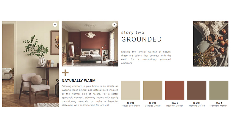
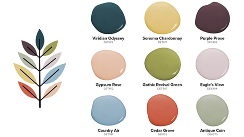
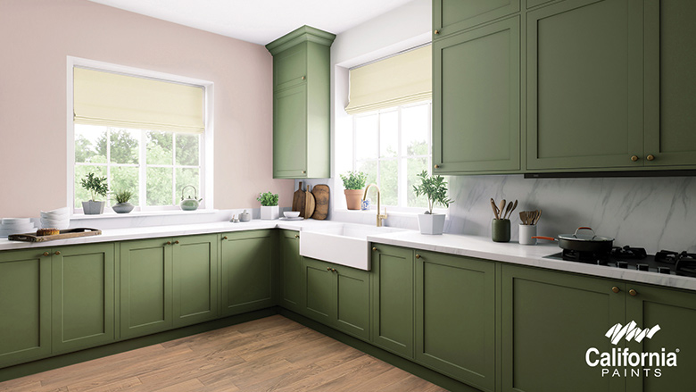
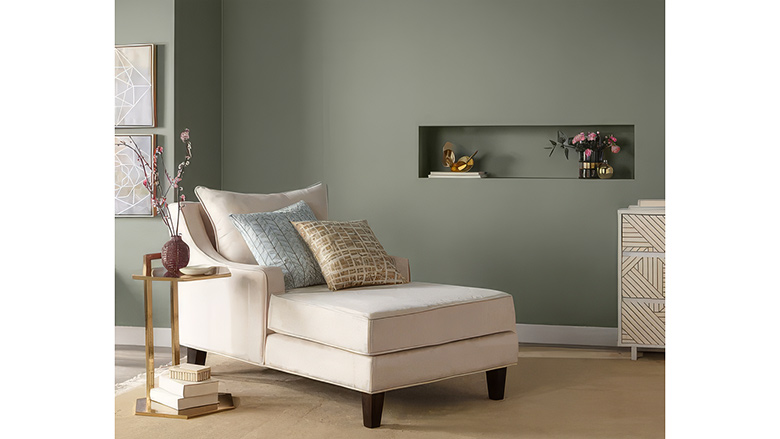
One of the most visible changes is the continued move away from single color selections toward structured palettes and coordinated families. Dunn-Edwards, C2 Paint and Clark+Kensington each paired their featured colors with supporting collections designed to extend versatility across residential and commercial spaces. Companies that choose the collection approach seem to be focused on Color of Year announcements not just being a “moment,” but rather a lasting impression that can be applied to different substrates and across product lines.
COLOR OF THE YEAR GALLERY SHOWCASING COLLECTIONS
Color from the Ground Up
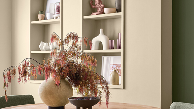
Warm neutrals, muted greens and earthy browns dominate the 2026 architectural landscape. Selections such as California Paints’ Cactus Valley, Valspar’s Warm Eucalyptus and Sherwin-Williams’ Universal Khaki point to a sustained preference for restorative, nature-driven tones. Rather than bold statements, many of these colors emphasize longevity.
ARCHITECTURAL NEUTRAL GALLERY
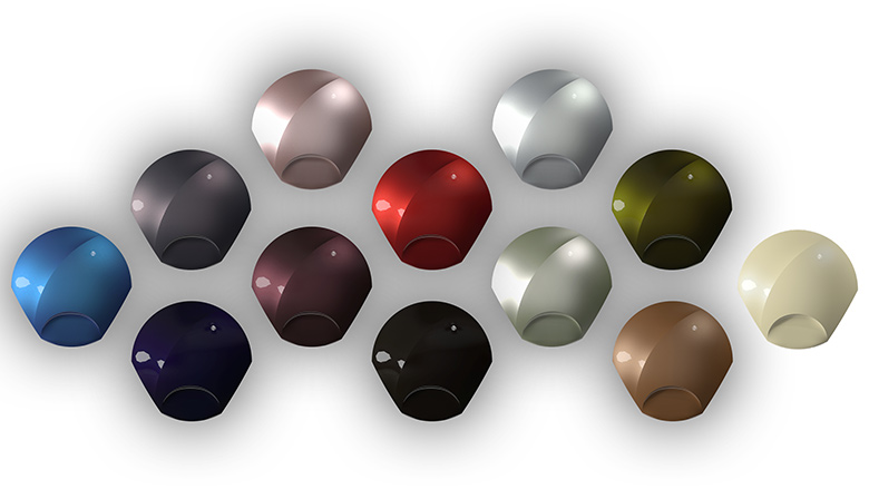
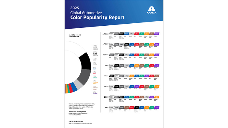
Color on the Road
Automotive programs continue to operate on extended horizons, a trend that has been with this segment for a while. Axalta’s popularity report and BASF Coatings’ trends collection highlight how pigment technology, surface effects and finish architecture increasingly shape future palettes well before they reach production.
AUTOMOTIVE GALLERY
Beyond the Swatch
Beyond the colors themselves, the releases are also a platform for storytelling, product positioning and experience design.
While online presentations and videos remain central to most launches, many companies are extending announcements into physical and experiential formats.
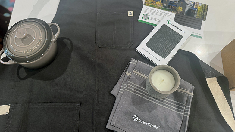
When Color Meets Craft
James Hardie’s curated mailer framed its Color of the Year as an experience rather than a simple reveal. Built around a kitchen and culinary theme, the package paired the announcement with tactile and lifestyle elements designed to engage multiple senses.
The mailing included cookware, a candle and an apron alongside the color materials, positioning the selection within a broader story of craft, making and everyday ritual. Rather than presenting a swatch alone, the reveal connected color to lived experience as much as design intent.
Finish with a Story
Digital campaigns are also evolving. After last year’s “Loneliest Color,” Sherwin-Williams expanded the concept with its “Beauty in Every Finish” campaign, which celebrates transformation across unconventional designs and surface types. The initiative centers on the idea that beauty is not defined by form alone, but by the finish that brings it to life.
More coverage of this campaign, and its technical implications, will appear in PCI later this year.

The Sound of Color
While launch campaigns reveal how companies present color to the market, the deeper story often unfolds behind the scenes in the how.
To explore that process, PCI launched a color-focused podcast series throughout January, with additional episodes continuing into February. The conversations move beyond finished shades to examine forecasting, pigment development and application performance across markets.

Benjamin Moore’s Andrea Magno describes how design research and performance testing guide selections intended to endure beyond a single season.
Minwax’s Lisbeth Parada extends the discussion into wood finishes, where forecasting intersects directly with substrate behavior and stain chemistry.
At PPG, Vanessa Peterson explains how cultural research, regional signals and technical validation converge to shape both long-range forecasts and Color of the Year strategy, followed by a second episode that traces how those directions translate across products and industrial applications.
The series will continue in February with Color Marketing Group’s Montaha Hidefi, shifting the lens further upstream to multi-year forecasting and its influence on pigment development and formulation planning.
All episodes are available in PCI’s podcast hub.
Where Color Meets Chemistry
No matter how compelling the narrative, a color ultimately succeeds only if it can be manufactured consistently, matched accurately and perform reliably across substrates and environments.
For pigment suppliers and formulators, these announcements often signal shifting demand for chromatic ranges, evolving durability expectations and increasing pressure to balance aesthetics with sustainability and regulatory compliance.
You can read and see more of this year’s color announcements on our website here.